
- Go to ADSCore
- Made in Italy

- Custom Apparel
- Most Popular
- Sublimation Ready
- $1.89 T-Shirts
- $4.99 Sweatshirts
- $5.99 Hoodies
- Track Order
Follow Us:


 All
All
 Go to Gildan
 Go to Richardson
 Go to Afton
 Go to Bella + Canvas
 Click Here To Shop
 Go to Comfort Colors
 View All
 Go to Next Level
 Go to Rabbit Skins
 Go to Jerzees
 Go to Hanes
 Go to Yupoong
 Go to Shakawear
 Go to Otto Cap
 Go to Port & Company
 Go to ADSCore
 Go for District
 Go for Sport Tek
 Go for Port Authority
 Go for dtfx
 Go to ADSCoreMade in
An often overlooked part of the t-shirt design process is choosing a font. This choice can make or break the entire design.
With so many awesome fonts out there, how are you supposed to choose the right one?
We've put together this guide to t-shirt font design so that you can learn more about choosing the best fonts for your project.
In this article, we'll cover typography basics, our tips for choosing the right font, the most used fonts, and where to get fonts. In the end, you'll have the tools needed to make your t-shirt design ideas look incredible.
Let's start from the beginning and break typography down to its basic components.
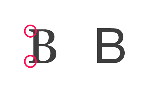
Typography is the art of using text in a design. It includes the usage of different typefaces and fonts.
A typeface is an overall appearance and aesthetic of a particular section of text. Helvetica or Times New Roman are two examples of typefaces. It's also common to refer to Serif and Sans as a typeface or category of fonts.
 Source: uxplanet.org
A font is a typeface and its size, weight, and treatment requirements. For example, Helvetica, Bold, 14 pt is a font. Or Times New Roman, Bold, Italicized, 12 pt.
If you're brand new to t-shirt design, you might think that there isn't all that much to typography. You pick a font that you like and go, right?
In actuality, 95% of graphic design for t-shirts is typography. Design students study typography in great depth and some people dedicate their whole life to it. There are many different trends, styles, and schools of thought when it comes to this subject.
Fortunately, you don't have to dedicate years of your life to studying typography to make an awesome t-shirt design.
So how do you go about choosing the right font for your t-shirt? Here are three tips about t-shirt fonts that will help you pick the perfect one.
We recommend trying out several different fonts during the design process, choosing appropriate fonts to convey your message, and making sure that your t-shirt is readable.
The biggest rookie mistake when designing t-shirts is choosing the first font that you like. Selecting the right font is a process. It's important to explore several different options before you choose.
Trying a few different options also helps you avoid the most overused, or even infamous, fonts. Pick three to four that could potentially work for your t-shirt design, then compare them side by side and pick your favorite.
One extremely helpful way to narrow down your choices is sorting fonts by category. Some common font categories include standard, decorative, college, retro, distressed, and so on. Try to pick a category that fits with the message or brand of your t-shirt.
The next point in our list of tips about t-shirt fonts is to choose fonts that are appropriate for your brand, organization, or message. Fonts that are appropriate for elementary school t-shirts would look silly on t-shirts for a law firm.
Fonts can sometimes mean more than the words on a t-shirt. Different fonts evoke different emotions, have different characteristics, and make different first impressions. They tell people what they're supposed to think and feel about what they're reading, as they're reading it.
Think about who will be wearing your t-shirts. What are their tastes and expectations? What do you want to communicate to them about your business, product, brand, or campaign?
The font that you select should complement and enhance the message you are trying to send. But it also shouldn't be the main focus of your t-shirt. A good font is a precisely measured spice, not the main course.
You would think that ensuring that the text on your t-shirt is readable goes without saying. Unfortunately, many novice designers make the mistake of choosing fonts that are extremely hard to read.
When choosing a font on your t-shirt, make sure that the typeface you select is readable even from a distance. Lean towards fonts without too many extra embellishments to prioritize readability. Use fancier, more decorative fonts sparingly, and never for big blocks of text.
In the seemingly endless sea of awesome fonts, there are a few that truly stand out.
Here are the seven most popular fonts for t-shirt designs. All of these fonts are highly readable, but each one works best in a particular style of design.
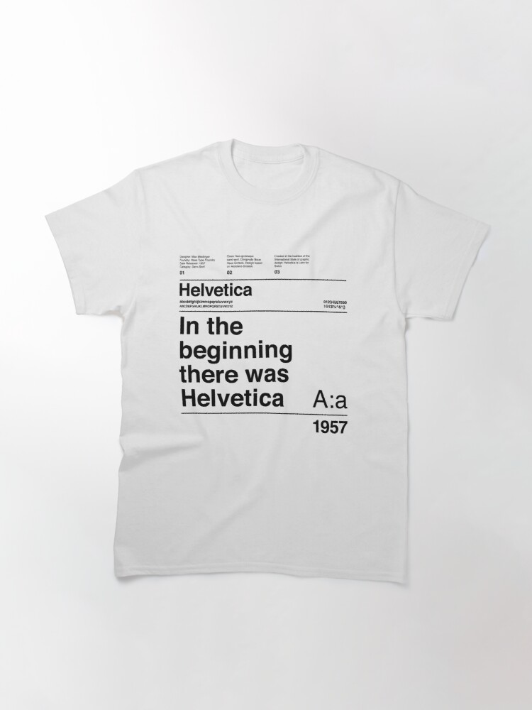
Source: Redbubble.com
Helvetica is an extremely popular sans-serif typeface that was developed in 1957. It's an excellent choice for t-shirt design because it prioritizes readability and pairs well with many other fonts.
Helvetica features a tall x-height, which makes it easier to read at a distance. It also has tight spacing between the letters and wide capital letters that all have the same width.
Helvetica is a smart, safe choice that can work beautifully on just about any design. But be wary of using it on small text sizes as it starts to have very tight apertures, which are the white spaces between a letter's interior and exterior. This can make it hard to read.
Source: bonfire.com
Oswald was actually designed to better fit the pixel grid of standard digital screens. It is used widely across the internet because it was intentionally designed to be extremely readable.
Oswald pairs well with many different fonts and thus can be used for many different designs. It's a great choice for an important line of text that features a quote or company slogan.
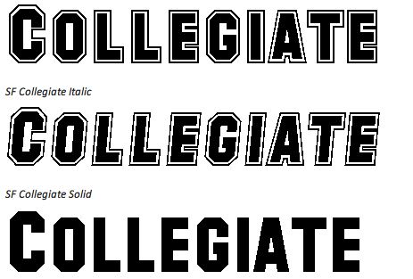
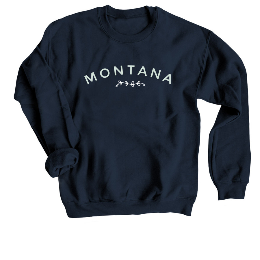
Collegiate is a very recognizable font that is most often used on academia-inspired designs. It's also very popular with sports teams.
This font's bold, all-caps design is perfect for a large text that consists of one to three words. It is available in multiple weights, which allows you to customize your design.
Collegiate can also be customized to have one overall font color with a small line of another color running through the letters. This is a great way to highlight a sports team's signature colors.
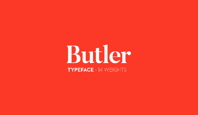
Butler is a newer serif typeface that received a font of the month award from Computer Arts Magazine. It's a modern take on classic serif fonts that comes with 14 different weights for customization.
Butler is an excellent choice for a very large title on a t-shirt. It works extremely well with classy designs that evoke an "old-timey" feel.
While Butler is a very readable font, avoid using it on small text. It is designed to draw and hold attention, so use this font on the text that you want readers of your t-shirt to look at first.
Source: bonfire.com
Monserrat is an urban typeface inspired by old posters and signs in the Montserrat neighborhood of Buenos Aires. It is a simple, readable font that works beautifully in smaller sizes.
Monserrat is a great choice for the text that you want people to read second or third on your design. Monserrat alternates is a more whimsical take on this classic font that features lots of curves without sacrificing readability.
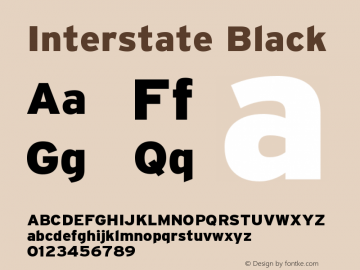
Interstate Black is a variation of the Interstate font family designed by Tobias Frere-Jones. This family was inspired by the signage of the Federal Highway Administration. It was designed to provide a distinct edge in swift communication.
Interstate Black is a thick, yet readable font that incorporates sharp diagonal lines into the tops and bottoms of its lowercase letters. This font is a great choice for text on your t-shirt that you want to be communicated quickly and clearly. It's perfect for designs that are serious, rather than whimsical.
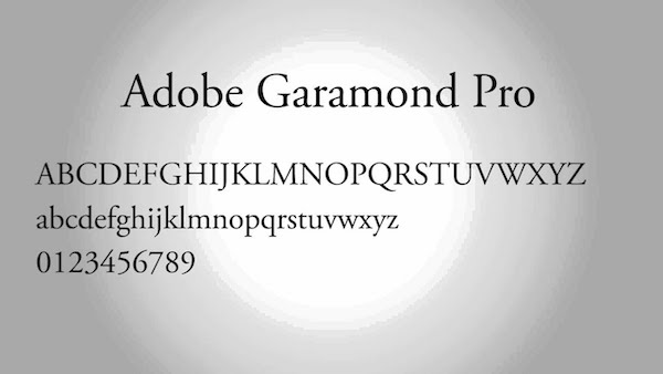
Garamond Pro is the perfect alternative to the overused Times New Roman. This is a great choice for elegant designs, especially ones that incorporate art pieces or larger blocks of text.
Whatever design program you prefer to use will come pre-loaded with fonts. But there are also tons of online resources that you can use to get more. These are our top three picks for the best places to get fonts.
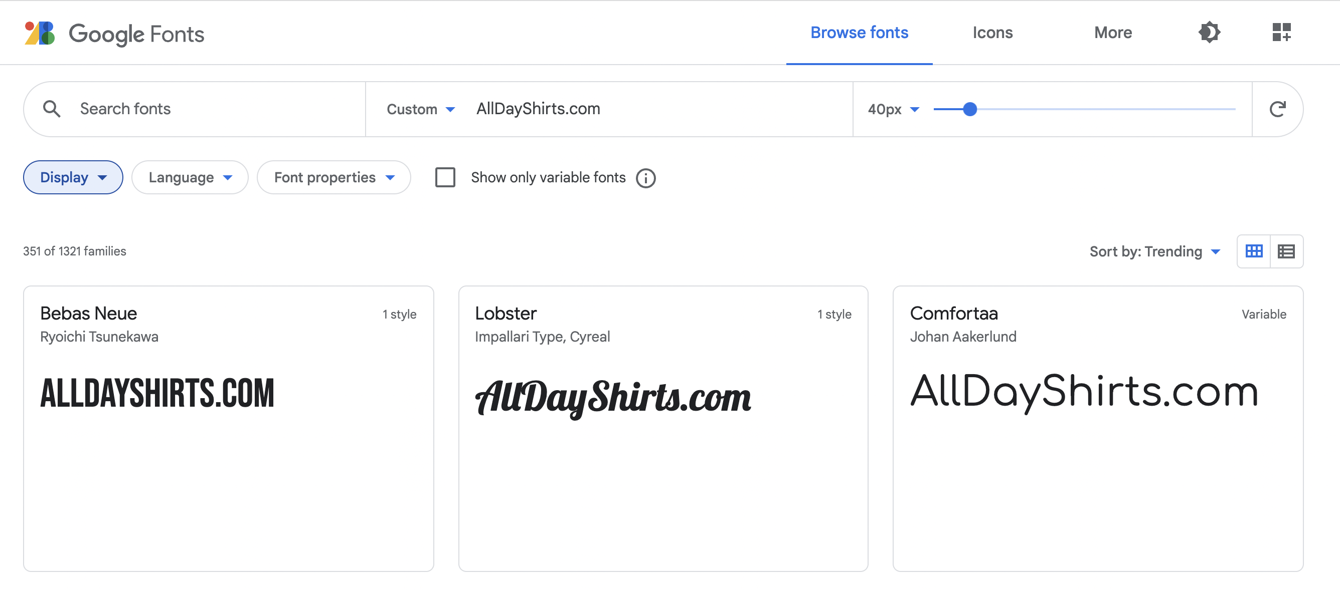
Google Fonts is an excellent online directory of free designer fonts. You can search fonts by name, category, language, properties, and more. You can even type in an example sentence to see how it would look in different fonts.
Font Squirrel is another great resource. This website features a massive library of free, high-quality fonts. They also feature deals from Font Spring, which has simple and flexible licensing.
If you're prepared to pay for access to some of the best and hottest fonts around, Creative Market Fonts is the destination for you. This site features professional quality typeface bundles that are perfect for unique, high-quality designs.
The key to creating good t-shirt designs is properly utilizing the right fonts. Now that you know how to pick the best fonts for t-shirts, you can elevate your designs to the next level.
At AllDayShirts.com, we are proud to be a second-generation, USA-owned, and operated wholesaler of blank t-shirts. If you're ready to find the perfect canvas for your design, check out our shop today.
Please email media@alldayshirts.com
